jeremykenedy/laravel-toast
Composer 安装命令:
composer require jeremykenedy/laravel-toast
包简介
Multi-framework toast notifications for Laravel with Tailwind, Bootstrap 5, Bootstrap 4, Blade, Livewire, Vue, React, and Svelte support.
README 文档
README
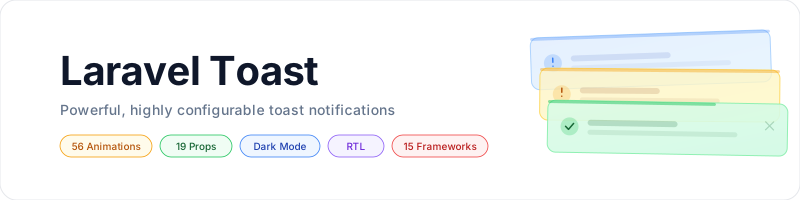
Powerful, highly configurable toast notifications for Laravel with 56 animations,
19 per-toast props, RTL support, dark mode, and full CSS/frontend framework parity.

Table of Contents
- Framework Support
- Installation
- Quick Start
- Configuration
- Props Reference
- Animations
- Dark Mode
- Customizing Colors
- Usage
- Changing Frameworks
- Artisan Commands
- Testing
- License
Framework Support
Every CSS and frontend combination is fully supported with identical features:
| Blade + Alpine.js | Livewire 3 | Vue 3 | React 18 | Svelte 4 | |
|---|---|---|---|---|---|
| Tailwind v4 | ✅ | ✅ | ✅ | ✅ | ✅ |
| Bootstrap 5 | ✅ | ✅ | ✅ | ✅ | ✅ |
| Bootstrap 4 | ✅ | ✅ | ✅ | ✅ | ✅ |
15 combinations. Zero feature gaps.
Requirements
- PHP 8.2+
- Laravel 12 or 13
- One CSS framework: Tailwind v4, Bootstrap 5, or Bootstrap 4
- One frontend: Blade + Alpine.js, Livewire 3, Vue 3, React 18, or Svelte 4
Installation
composer require jeremykenedy/laravel-toast
php artisan toast:install
Add to your layout before </body>:
@include('toast::toasts')
Or with the directive: @toasts
For Livewire: <livewire:toast-container />
Quick Start
// In any controller, service, or middleware
toast('Settings saved.');
toast('Upload failed.', 'error', 'Error');
toast('Heads up!', 'warning', null, 3000);

// Fluent chaining
toast()->success('Step 1 done.')->info('Starting step 2...');

// Facade
Toast::success('Created!');
Toast::error('Denied.', 'Access Error');
Existing flash messages work automatically:
return back()->with('success', 'Profile updated.');
// Displays as a success toast with no code changes
Configuration
php artisan vendor:publish --tag=toast-config
Every config option is also an ENV variable and a per-toast prop override:
TOAST_POSITION=top-right
TOAST_DIR=ltr
TOAST_DURATION=5000
TOAST_AUTO_DISMISS=true
TOAST_PAUSE_ON_HOVER=true
TOAST_STACK=true
TOAST_SHOW_ICONS=true
TOAST_SHOW_BORDER=true
TOAST_SHOW_CLOSE=true
TOAST_SHOW_PROGRESS=true
TOAST_PROGRESS_DIRECTION=rtl
TOAST_PROGRESS_POSITION=top
TOAST_OPACITY=1
TOAST_ENTER_ANIMATION=none
TOAST_ENTER_DURATION=0.5
TOAST_EXIT_ANIMATION=none
TOAST_EXIT_DURATION=0.5
TOAST_MAX_VISIBLE=5
Props Reference
All props work as global config defaults AND per-toast overrides.
| Prop | Default | Options |
|---|---|---|
position |
top-right |
top-left top-right top-center bottom-left bottom-right bottom-center |
dir |
ltr |
ltr rtl |
duration |
5000 |
Milliseconds (0 = no auto-dismiss) |
auto_dismiss |
true |
true false |
pause_on_hover |
true |
true false |
stack |
true |
true (accumulate) false (replace) |
max_visible |
5 |
Any integer |
show_icon |
true |
true false |
custom_icon |
null |
Raw SVG HTML string |
show_border |
true |
true false |
show_close |
true |
true false |
show_progress |
true |
true false |
progress_direction |
rtl |
rtl ltr |
progress_position |
top |
top bottom |
opacity |
1 |
0 to 1 |
enter_animation |
none |
See Animations |
enter_duration |
0.5 |
Seconds |
exit_animation |
none |
See Animations |
exit_duration |
0.5 |
Seconds |
Per-Toast Override
toast()->success('Saved!', 'Done', 3000, [
    'position'           => 'bottom-right',
    'dir'                => 'rtl',
    'show_border'        => false,
    'show_close'         => false,
    'enter_animation'    => 'slide-right',
    'enter_duration'     => 0.3,
    'exit_animation'     => 'bounce-left',
    'exit_duration'      => 0.5,
    'progress_position'  => 'bottom',
    'opacity'            => 0.9,
]);
Animations
56 animation styles available for both enter_animation and exit_animation.
Directionless names (e.g., slide, bounce) use a sensible default (typically center or right):
| Style | Enter | Exit |
|---|---|---|
none |
Instant appear | Instant remove |
| Fade | ||
fade |
Fade in | Fade out |
fade-center |
Fade in (alias) | Fade out (alias) |
| Slide | ||
slide |
Slide in from right (default) | Slide out to right (default) |
slide-left |
Slide in from left | Slide out to left |
slide-right |
Slide in from right | Slide out to right |
slide-top |
Slide in from top | Slide out to top |
slide-bottom |
Slide in from bottom | Slide out to bottom |
| Bounce | ||
bounce |
Scale up, overshoot, settle (default) | Scale up, overshoot, shrink (default) |
bounce-left |
Overshoot from left then settle | Bounce right then exit left |
bounce-right |
Overshoot from right then settle | Bounce left then exit right |
bounce-top |
Overshoot from top then settle | Bounce down then exit top |
bounce-bottom |
Overshoot from bottom then settle | Bounce up then exit bottom |
bounce-center |
Scale up, overshoot, settle | Scale up, overshoot, shrink |
| Shrink | ||
shrink |
Scale up from center (default) | Scale down to center (default) |
shrink-left |
Expand from right edge | Collapse toward right edge |
shrink-right |
Expand from left edge | Collapse toward left edge |
shrink-top |
Expand from bottom edge | Collapse toward bottom edge |
shrink-bottom |
Expand from top edge | Collapse toward top edge |
shrink-center |
Scale up from center | Scale down to center |
| Flip (3D) | ||
flip |
Flip in 180 Y-axis (default) | Flip out 180 Y-axis (default) |
flip-left |
Flip in from right (Y-axis) | Flip out to left (Y-axis) |
flip-right |
Flip in from left (Y-axis) | Flip out to right (Y-axis) |
flip-top |
Flip in from bottom (X-axis) | Flip out to top (X-axis) |
flip-bottom |
Flip in from top (X-axis) | Flip out to bottom (X-axis) |
flip-center |
Flip in 180 (Y-axis) | Flip out 180 (Y-axis) |
| Spin | ||
spin |
Spin in + scale up (default) | Spin out + scale down (default) |
spin-left |
Spin in from left | Spin out to left |
spin-right |
Spin in from right | Spin out to right |
spin-top |
Spin in from top | Spin out to top |
spin-bottom |
Spin in from bottom | Spin out to bottom |
spin-center |
Spin in + scale up | Spin out + scale down |
| Grow | ||
grow |
Scale up from center (default) | Scale down to center (default) |
grow-left |
Scale up from right edge | Scale down toward right edge |
grow-right |
Scale up from left edge | Scale down toward left edge |
grow-top |
Scale up from bottom edge | Scale down toward bottom edge |
grow-bottom |
Scale up from top edge | Scale down toward top edge |
grow-center |
Scale up from center | Scale down to center |
| Slam (overshoot) | ||
slam |
Scale from 0, overshoot 120%, settle (default) | Overshoot 115%, scale to 0 (default) |
slam-left |
Fly in from left, overshoot 115%, settle | Overshoot 115%, fly out left |
slam-right |
Fly in from right, overshoot 115%, settle | Overshoot 115%, fly out right |
slam-top |
Fly in from top, overshoot 115%, settle | Overshoot 115%, fly out top |
slam-bottom |
Fly in from bottom, overshoot 115%, settle | Overshoot 115%, fly out bottom |
slam-center |
Scale from 0, overshoot 120%, settle | Overshoot 115%, scale to 0 |
| Wobble | ||
wobble |
Wobble side-to-side then appear (default) | Wobble side-to-side then disappear |
wobble-left |
Wobble in from left | Wobble then exit left |
wobble-right |
Wobble in from right | Wobble then exit right |
wobble-top |
Wobble in from top | Wobble then exit top |
wobble-bottom |
Wobble in from bottom | Wobble then exit bottom |
wobble-center |
Wobble + scale up from center | Wobble + scale down to center |
Enter and exit animations have independent duration controls (enter_duration, exit_duration).
Dark Mode
All three CSS frameworks support dark mode:
Tailwind v4 uses dark: variant classes automatically. No extra setup needed.
Bootstrap 5 uses text-bg-* classes that respect [data-bs-theme="dark"]. Add to your <html> tag:
<html data-bs-theme="dark"></html>
Bootstrap 4 uses inline styles for dark mode. The toast views detect .dark on the body class or prefers-color-scheme: dark media query.
Customizing Colors
Tailwind v4
Override toast colors via your app.css with theme accent variables or direct utility overrides:
/* Light mode */
.toast-success {
    @apply bg-emerald-50 text-emerald-900 border-emerald-300;
}
.toast-error {
    @apply bg-rose-50 text-rose-900 border-rose-300;
}

/* Dark mode */
.dark .toast-success {
    @apply bg-emerald-950 text-emerald-100 border-emerald-700;
}
.dark .toast-error {
    @apply bg-rose-950 text-rose-100 border-rose-700;
}
Or publish and edit the views directly:
php artisan vendor:publish --tag=toast-views
# Edit resources/views/vendor/toast/tailwind/blade/toasts.blade.php
Bootstrap 5
Override Bootstrap contextual colors in your stylesheet:
/* Light mode */
.toast.text-bg-success {
    background-color: #d1fae5 !important;
    color: #065f46 !important;
}
.toast.text-bg-danger {
    background-color: #fee2e2 !important;
    color: #991b1b !important;
}

/* Dark mode */
[data-bs-theme="dark"] .toast.text-bg-success {
    background-color: #064e3b !important;
    color: #d1fae5 !important;
}
[data-bs-theme="dark"] .toast.text-bg-danger {
    background-color: #7f1d1d !important;
    color: #fee2e2 !important;
}
Bootstrap 4
Override Bootstrap 4 alert colors:
/* Light mode */
.alert-success {
    background-color: #d1fae5;
    border-color: #6ee7b7;
    color: #065f46;
}
.alert-danger {
    background-color: #fee2e2;
    border-color: #fca5a5;
    color: #991b1b;
}

/* Dark mode */
.dark .alert-success,
@media (prefers-color-scheme: dark) {
    .alert-success {
        background-color: #064e3b;
        border-color: #047857;
        color: #d1fae5;
    }
}
.dark .alert-danger,
@media (prefers-color-scheme: dark) {
    .alert-danger {
        background-color: #7f1d1d;
        border-color: #b91c1c;
        color: #fee2e2;
    }
}
Usage
Facade
use Jeremykenedy\LaravelToast\Facades\Toast;

Toast::success('Saved.');
Toast::error('Failed.', 'Error');
Toast::warning('Low storage.');
Toast::info('Update available.');
Toast::clear();
HasToasts Trait
use Jeremykenedy\LaravelToast\Traits\HasToasts;

class UserController extends Controller
{
    use HasToasts;

    public function update(Request $request, User $user)
    {
        $user->update($request->validated());
        $this->toastSuccess('User updated.');
        return back();
    }
}
Livewire Events
// From any Livewire component
$this->dispatch('toast', message: 'Saved!', type: 'success');
$this->dispatch('toast-success', message: 'Created!');
$this->dispatch('toast-error', message: 'Failed!');

// With per-toast options
$this->dispatch('toast', message: 'RTL toast', type: 'info', options: [
    'dir' => 'rtl',
    'exit_animation' => 'slide-left',
]);
Vue / React / Svelte
Pass toasts via Inertia props or window.__toasts:
// Controller
return Inertia::render('Dashboard', [
    'toasts' => app(ToastManager::class)->get(),
]);
<!-- Or in Blade layout -->
<script>
    window.__toasts = @json(app(ToastManager::class)->get());
</script>
Changing Frameworks
After installation, use update or switch to change frameworks without losing configuration.
Update (Interactive)
The update command walks through framework selection with an interactive menu:
php artisan toast:update
Or pass options directly:
php artisan toast:update --css=bootstrap5 --frontend=vue
| Option | Values | Description |
|---|---|---|
--css |
tailwind, bootstrap5, bootstrap4 |
Change CSS framework |
--frontend |
blade, livewire, vue, react, svelte |
Change frontend framework |
Switch (Quick)
php artisan toast:switch --css=bootstrap5
php artisan toast:switch --frontend=livewire
php artisan toast:switch --css=tailwind --frontend=vue
After switching, run npm run build.
Artisan Commands
| Command | Description |
|---|---|
toast:install |
Fresh install with interactive prompts. Detects existing installation. |
toast:update |
Update framework selection interactively. Does not overwrite config. |
toast:switch |
Quick framework switch via flags. |
Install Options
| Flag | Description |
|---|---|
--css= |
CSS framework: tailwind, bootstrap5, bootstrap4 |
--frontend= |
Frontend: blade, livewire, vue, react, svelte |
--force |
Skip reinstall confirmation when already installed |
Publishing Assets
php artisan vendor:publish --tag=toast-config
php artisan vendor:publish --tag=toast-views
php artisan vendor:publish --tag=toast-lang
Testing
./vendor/bin/pest --ci
License
This package is open-sourced software licensed under the MIT license.
jeremykenedy/laravel-toast 适用场景与选型建议
jeremykenedy/laravel-toast 是一款 基于 Blade 开发的 Composer 扩展包,目前已累计 8 次下载、GitHub Stars 达 1, 最近一次更新时间为 2026 年 04 月 01 日, 在 PHP 生态内属于活跃度较高的组件。
它主要适用于以下技术方向: 「bootstrap」 「notifications」 「flash」 「laravel」 「react」 「toast」 等业务场景。在实际项目中,围绕这些方向常见需要落地的问题包括:接口对接、性能调优、并发安全、与既有框架(Laravel / ThinkPHP / Yii / Webman 等)的兼容适配,以及生产环境的日志埋点与稳定性保障。
我们在过去多个企业项目中使用过 jeremykenedy/laravel-toast 或与其功能相近的方案,如果你在选型或落地过程中遇到问题,例如 版本兼容、二次改造、私有化封装、与内部系统对接、生产 BUG 排查,欢迎联系我们协助评估。
基于 jeremykenedy/laravel-toast 在你已有业务上做功能扩展、字段裁剪、UI 适配、与内部账号 / 权限 / 日志系统的深度对接。
线上偶发问题、内存泄漏、慢查询、并发异常等排查修复;针对高流量场景做缓存、队列、索引层面的调优。
承接完整的项目从需求 → 设计 → 开发 → 上线 → 长期运维;也可按月提供技术保姆服务。
与 jeremykenedy/laravel-toast 相关的其它包
同方向 / 同关键字的高下载量 PHP Composer 包推荐,方便对比选型:
A Laravel Nova package that adds a notification feed in your Nova app.
Views for the package MedicOneSystems Livewire Datatables with Bootstrap 4
Notification component for storing and retrieving flash data.
bootstrap select field module implementing http://silviomoreto.github.io/bootstrap-select/
Shim repository for WebcamJS
Captures outgoing SMS notifications
统计信息
- 总下载量: 8
- 月度下载量: 0
- 日度下载量: 0
- 收藏数: 1
- 点击次数: 34
- 依赖项目数: 0
- 推荐数: 0
其他信息
- 授权协议: MIT
- 更新时间: 2026-04-01