levmyshkin/coloris
Composer 安装命令:
composer require levmyshkin/coloris
包简介
A lightweight and elegant JavaScript color picker written in vanilla ES6.
README 文档
README
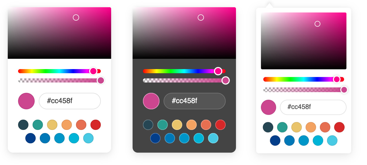
A lightweight and elegant JavaScript color picker written in vanilla ES6.
Convert any text input field into a color field.
Features
- Zero dependencies
- Very easy to use
- Customizable
- Themes and dark mode
- Opacity support
- Color swatches
- Multiple color formats
- Touch support
- Fully accessible
- Works on all modern browsers (no IE support)
Getting Started
Basic usage
Download the latest version, and add the script and style to your page:
<link rel="stylesheet" href="coloris.min.css"/>
<script src="coloris.min.js"></script>
Or include from a CDN (not recommended in production):
<link rel="stylesheet" href="https://cdn.jsdelivr.net/gh/mdbassit/Coloris@latest/dist/coloris.min.css"/>
<script src="https://cdn.jsdelivr.net/gh/mdbassit/Coloris@latest/dist/coloris.min.js"></script>
Then just add the data-coloris attribute to your input fields:
<input type="text" data-coloris>
That's it. All done!
What about NPM and TypeScript?
Thanks to @melloware, NPM and TypeScript support is available in a fork of this project. Head over to @melloware's fork or to their NPM repo for more information.
Customizing the color picker
The color picker can be configured by calling Coloris() and passing an options object to it. For example, to activate dark mode and disable alpha support:
Coloris({
  themeMode: 'dark',
  alpha: false
});
The new options are applied at runtime and can be updated at any time and as often as needed. For instance, to re-enable alpha support when clicking on a button:
document.querySelector('#mybutton').addEventListener('click', e => {
  Coloris({
    alpha: true
  });
});
Here is a list of all the available options:
Coloris({
  // The default behavior is to append the color picker's dialog to the end of the document's
  // body. but it is possible to append it to a custom parent instead. This is especially useful
  // when the color fields are in a scrollable container and you want the color picker's dialog
  // to remain anchored to them. You will need to set the CSS position of the desired container
  // to "relative" or "absolute".
  // The value of this option can be either a CSS selector or an HTMLElement/Element/Node.
  // Note: This should be a scrollable container with enough space to display the picker.
  parent: '.container',

  // A custom selector to bind the color picker to. This must point to HTML input fields.
  // This can also accept an HTMLElement or an array of HTMLElements instead of a CSS selector.
  el: '.color-field',

  // The bound input fields are wrapped in a div that adds a thumbnail showing the current color
  // and a button to open the color picker (for accessibility only). If you wish to keep your
  // fields unaltered, set this to false, in which case you will lose the color thumbnail and
  // the accessible button (not recommended).
  // Note: This only works if you specify a custom selector to bind the picker (option above),
  // it doesn't work on the default [data-coloris] attribute selector.
  wrap: true,

  // Set to true to activate basic right-to-left support.
  rtl: false,

  // Available themes: default, large, polaroid, pill (horizontal).
  // More themes might be added in the future.
  theme: 'default',

  // Set the theme to light or dark mode:
  // * light: light mode (default).
  // * dark: dark mode.
  // * auto: automatically enables dark mode when the user prefers a dark color scheme.
  themeMode: 'light',

  // The margin in pixels between the input fields and the color picker's dialog.
  margin: 2,

  // Set the preferred color string format:
  // * hex: outputs #RRGGBB or #RRGGBBAA (default).
  // * rgb: outputs rgb(R, G, B) or rgba(R, G, B, A).
  // * hsl: outputs hsl(H, S, L) or hsla(H, S, L, A).
  // * auto: guesses the format from the active input field. Defaults to hex if it fails.
  // * mixed: outputs #RRGGBB when alpha is 1; otherwise rgba(R, G, B, A).
  format: 'hex',

  // Set to true to enable format toggle buttons in the color picker dialog.
  // This will also force the format option (above) to auto.
  formatToggle: false,

  // Enable or disable alpha support.
  // When disabled, it will strip the alpha value from the existing color string in all formats.
  alpha: true,

  // Set to true to always include the alpha value in the color value even if the opacity is 100%.
  forceAlpha: false,

  // Set to true to hide all the color picker widgets (spectrum, hue, ...) except the swatches.
  swatchesOnly: false,

  // Focus the color value input when the color picker dialog is opened.
  focusInput: true,

  // Select and focus the color value input when the color picker dialog is opened.
  selectInput: false,

  // Show an optional clear button
  clearButton: false,

  // Set the label of the clear button
  clearLabel: 'Clear',

  // Show an optional close button
  closeButton: false,

  // Set the label of the close button
  closeLabel: 'Close',

  // An array of the desired color swatches to display. If omitted or the array is empty,
  // the color swatches will be disabled.
  swatches: [
    '#264653',
    '#2a9d8f',
    '#e9c46a',
    'rgb(244,162,97)',
    '#e76f51',
    '#d62828',
    'navy',
    '#07b',
    '#0096c7',
    '#00b4d880',
    'rgba(0,119,182,0.8)'
  ],

  // Set to true to use the color picker as an inline widget. In this mode the color picker is
  // always visible and positioned statically within its container, which is by default the body
  // of the document. Use the "parent" option to set a custom container.
  // Note: In this mode, the best way to get the picked color, is listening to the "coloris:pick"
  // event and reading the value from the event detail (See example in the Events section). The
  // other way is to read the value of the input field with the id "clr-color-value".
  inline: false,

  // In inline mode, this is the default color that is set when the picker is initialized.
  defaultColor: '#000000',

  // A function that is called whenever a new color is picked. This defaults to an empty function,
  // but can be set to a custom one. The selected color and the current input field are passed to
  // the function as arguments.
  // Use in instances (described below) to perform a custom action for each instance.
  onChange: (color, input) => undefined
});
Accessibility and internationalization
Several labels are used to describe the various widgets of the color picker, which can be read aloud by a screen reader for people with low vision. If you wish to customize or translate those labels, you need to add an "a11y" option to the global Coloris object:
Coloris({
  a11y: {
    open: 'Open color picker',
    close: 'Close color picker',
    clear: 'Clear the selected color',
    marker: 'Saturation: {s}. Brightness: {v}.',
    hueSlider: 'Hue slider',
    alphaSlider: 'Opacity slider',
    input: 'Color value field',
    format: 'Color format',
    swatch: 'Color swatch',
    instruction: 'Saturation and brightness selector. Use up, down, left and right arrow keys to select.'
  }
});
Simulating multiple instances
Although there is only one physical instance of the color picker in the document, it is possible to simulate multiple instances, each with its own appearance and behavior, by updating the configuration at runtime. Here is an example of how to do it by manually setting configuration options in response to click events:
// Regular color fields use the default light theme
document.querySelectorAll('.color-fields').forEach(input => {
  input.addEventListener('click', e => {
    Coloris({
      theme: 'default',
      themeMode: 'light',
    });
  });
});

// But the special color fields use the polaroid dark theme
document.querySelectorAll('.special-color-fields').forEach(input => {
  input.addEventListener('click', e => {
    Coloris({
      theme: 'polaroid',
      themeMode: 'dark',
    });
  });
});
This works well and is quite versatile, but it can get a little hard to keep track of each change every "instance" makes and revert them to the default values.
So as of version 0.15.0, there is a new way to automatically manage virtual instances. This works by assigning configuration overrides to a CSS selector representing one or more color fields. Here is an example:
// Color fields that have the class "instance1" have a format toggle,
// no alpha slider, a dark theme and custom swatches
Coloris.setInstance('.instance1', {
  theme: 'polaroid',
  themeMode: 'dark',
  alpha: false,
  formatToggle: true,
  swatches: [
    '#264653',
    '#2a9d8f',
    '#e9c46a'
  ]
});

// Fields matching the class "instance2" show color swatches only
Coloris.setInstance('.instance2', {
  swatchesOnly: true,
  swatches: [
    '#264653',
    '#2a9d8f',
    '#e9c46a'
  ]
});
Any options that haven't been explicitly set by an instance will inherit the global values. So any common options should be set globally using the method described in the "Customizing the color picker" section above.
Please note that the options el, wrap, rtl, inline, defaultColor and a11y can only be set globally and not per instance.
N.B: There is only one true instance of the color picker, so it is not possible to show multiple instances at same time.
Events
All events are triggered on the last active input field that is bound to the color picker.
| Event | Description |
|---|---|
open |
The color picker is opened |
close |
The color picker is closed |
input |
A new color is selected |
change |
The color picker is closed and the selected color has changed |
In addition to the events above, a coloris:pick event is triggered on the document whenever a new color is picked. Example:
document.addEventListener('coloris:pick', event => {
  console.log('New color', event.detail.color);
});
Manually updating the thumbnail
The color thumbnail is updated when an input event is triggered on the adjacent input field. If you programmatically update the value of the input field, you may need to trigger the event manually using the following code:
document.querySelector('#color-field').dispatchEvent(new Event('input', { bubbles: true }));
Closing the color picker
The color picker dialog can be closed by clicking anywhere on the page or by pressing the ESC on the keyboard. The later will also revert the color to its original value.
If you would like to close the dialog programmatically, you can do so by calling the close() method:
// Close the dialog
Coloris.close();

// Close the dialog and revert the color to its original value
Coloris.close(true);
Building from source
Clone the git repo:
git clone git@github.com:mdbassit/Coloris.git
Enter the Coloris directory and install the development dependencies:
cd Coloris && npm install
Run the build script:
npm run build
The built version will be in the dist directory in both minified and full copies.
Alternatively, you can start a gulp watch task to automatically build when the source files are modified:
npm run start
Contributing
If you find a bug or would like to implement a missing feature, please create an issue first before submitting a pull request (PR).
When submitting a PR, please do not include the changes to the dist directory in your commits.
License
Copyright (c) 2021 Momo Bassit.
Coloris is licensed under the MIT license.
levmyshkin/coloris 适用场景与选型建议
levmyshkin/coloris 是一款 基于 JavaScript 开发的 Composer 扩展包,目前已累计 0 次下载、GitHub Stars 达 0, 最近一次更新时间为 2026 年 07 月 15 日, 在 PHP 生态内属于活跃度较高的组件。
我们在过去多个企业项目中使用过 levmyshkin/coloris 或与其功能相近的方案,如果你在选型或落地过程中遇到问题,例如 版本兼容、二次改造、私有化封装、与内部系统对接、生产 BUG 排查,欢迎联系我们协助评估。
基于 levmyshkin/coloris 在你已有业务上做功能扩展、字段裁剪、UI 适配、与内部账号 / 权限 / 日志系统的深度对接。
线上偶发问题、内存泄漏、慢查询、并发异常等排查修复;针对高流量场景做缓存、队列、索引层面的调优。
承接完整的项目从需求 → 设计 → 开发 → 上线 → 长期运维;也可按月提供技术保姆服务。
与 levmyshkin/coloris 相关的其它包
同方向 / 同关键字的高下载量 PHP Composer 包推荐,方便对比选型:
This module allows drag & drop grouping of items in a GridField
Adds text size controls and text-to-speech controls to Flarum discussion content.
Native Blade date, datetime, and date range pickers.
Symfony and Flysystem integration for the maintained KCFinder continuation.
Laravel integration for the maintained KCFinder continuation.
PHPStan rules shared across KnpLabs organization projects
统计信息
- 总下载量: 0
- 月度下载量: 0
- 日度下载量: 0
- 收藏数: 0
- 点击次数: 0
- 依赖项目数: 0
- 推荐数: 0
其他信息
- 授权协议: MIT
- 更新时间: 2026-07-15